Damned usury, « Cologne », « 1715 » : Delusion or bona fide ?
Typographical evolution on title pages in the Southern Netherlands in the 18th century and its potential as a means of identification
Goran PROOT
Research Fellow at Università degli Studi di Udine, Italy; voluntary research fellow at Ruusbroec Institute, Antwerp; lecturer at Plantin Institute of Typography, Antwerp
When I walked into an antiquarian bookshop the other day, my eye was caught by a rather unattractive old book in a display case waiting for an owner who would take care of it. First, I was intrigued by the condition and material features of this little book. In the absence of any sewing, wrappers or binding, the gatherings were just kept together by a single stab-stitched string going in and out close to the spine. Most of the title page appeared to have been covered for quite a long time by some smaller rectangular object which had left its mark. In particular, the still untrimmed lower and outer edges of the book block appeared quite brittle. Only then did my eyes alight on the title of this little treatise, which began with the words Den verdoemelycken woeker [The damned usury]. Although I have been working a great deal, and, at times, even exclusively, with early modern books from the Low Countries, I could not remember ever having come across a book in Dutch featuring the term usury [woeker], let alone damned usury [verdoemelyken woeker] on its title page. The name of its author, the Dominican friar Josephus Gillis, did not ring any bells with me, either, although this surname is not particularly uncommon in this part of the world. Despite the fact that it was written in Dutch, the book presented itself as a Cologne imprint, as being « tot Keulen, by Judocus Raben, 1715 ». A Dutch-language book printed in Cologne? This was certainly an oddity.
I asked for permission to inspect the book, because I wanted to see whether there was any other information elsewhere in the little volume which might either corroborate or falsify the statement in the imprint. That proved not to be the case: all four approbations at the back of the volume refer to dates in 1715. But suspicion was raised: none of the names in the approbations actually linked this work to Cologne. The first approbation was issued in Rotterdam by Hieronymus t’Seraerts, the Provincial of the Dominicans in the Netherlands, and signed 13 August 1715; the second approbation, dated 11 September 1715, was delivered by the Dominican theologian Thomas du Jardin, prior of the Ghent Dominican monastery; the third, dated 10 September 1715, was signed by Jacobus van Damme, bachelor of theology, and member of the Ghent Dominican convent ; and finally, the fourth was issued on 24 September 1715, by Joannes van den Hove, book censor and canon and treasurer of the Saint Bavo cathedral in Ghent. The first approbation refers explicitely to the text as being written « in de Vlaemsche taele » [written in Dutch], so why would anyone have this printed in Cologne when Ghent at that time hosted more than enough printers of its own who could carry out the job ?
I decided to buy the book, but not at the price marked on the last page, because, as I argued to the bookseller, the book could not possibly have been printed in the year given on the title page. My experience told me that it had to have been printed more recently than that (Fig. 1). Apart from the typefaces, which appeared to me to date from the late eighteenth century or later, there were also other typographical features which suggested a later date of production: the typographical ornament on the title page; the combination of both a fat and a thin horizontal line on the second leaf in lieu of a woodcut or metalcut headpiece; the large capitals at the beginning of each chapter, which did not sit neatly in the textblock, but stuck up above the first line. In addition, the gatherings were very sparingly signed, only on leaves one and three, except for the first one which remained unsigned. The book was printed on medium quality laid paper marked by some imperfections, but which clearly showed waterlines, chainlines and watermarks. Pinholes in the lower right corners of leaves C2 and G2 were witness to printing on a traditional printing press. Horizontal chainlines and traces of watermarks and countermarks in the upper part of the outer edge indicated that gatherings [A] through G, each of which consisted of 6 leaves, were printed in « duodecimo common » format, according to half-sheet imposition known as « work and turn »1. However, the final gathering H, which consists of eight leaves, is printed as an octavo, with vertical chainlines and with the watermark in the upper inner fold. This practice of mixing formats is very unusual for eighteenth-century books produced in the Southern Netherlands — the region from which I believe the work actually originated. Finally, the bookseller and I agreed on a price which, in my opinion, was more appropriate for its probable age, and the book duly changed hands.

Figures nos 1 & 2: Typographical title page and the first text page of Den verdoemelyken woeker.
AIM AND STATUS QUAESTIONIS
Everybody to whom I have shown this book thus far has reacted similarly: surely it must have been printed much later than stated on the title page. This article is concerned with the question of how we recognize a late eighteenth-century — or early nineteenth-century — imprint as being different from early eighteenth-century books. The aim of this contribution is to map a large number of typographical features of eighteenth-century title pages produced in the Southern Netherlands and to describe in which combinations they typically appear, and also how those combinations evolve over time, decade by decade. In this way, I hope to transform intuitive knowledge built up over many years of contact with eighteenth-century books from the Southern Netherlands into verifiable facts, which can be easily understood and used by anyone anywhere in the world who is working with books from this period and this region, such as scholars, librarians and curators, as well as antiquarians, bibliophiles, students, and laywomen and laymen.
Although this research question might seem somewhat basic, in fact it has never been addressed before in a systematic way with regard to title pages of eighteenth-century books produced in the Southern Netherlands. In recent years, aspects of the design and layout of books from this period and region have been discussed in only two case studies. In 2008, Tim Dankers published a detailed typographical analysis of about 30 pamphlets produced in the Southern Netherlands in the year 1790, hoping to identify specific typographical characteristics of those pamphlets closely connected with specific groups of intended readers2. In 2015, Pierre Delsaerdt discussed the ambitious but short-lived publishing strategy of a new publishing house in the Southern Netherlands, the Leuven University Press, which was founded in 1759. He describes how the founders of this press tried to distinguish themselves from other presses through the application of a specific typographical design associated with emerging neoclassical aesthetics3. Both case studies end up to some extent with inconclusive results and there are also a number of questions which remain unanswered due to the lack of preliminary studies detailing the overall typographical features for the period under consideration. Without an established solid bedrock of studies of typographical uses and trends, it proves to be very difficult to draw firm conclusions from small test-cases and therefore to progress in the quest to acquire a better understanding of how typography actually functions. Zooming in on specific cases gains considerably in meaning if one can also zoom out and consider their characteristics against a broader framework.
A detailed status quaestionis is provided by Ursula Rautenberg in an exemplary contribution from 2008 dealing with the development of the title page in Germany, the Low Countries and Venice in the fifteenth century4. Margaret McFadden Smith’s work on the early development of title pages in the west until 1510 is generally known, not least because it was published in English. In contrast to older studies, Smith’s survey is based on a vast collection of bibliographic data including an important number pertaining to the Low Countries5. But, as Rautenberg discussed, there are more relevant studies which precede Smith’s. Commonly known are those produced by Alfred W. Pollard and Konrad Haebler, but there are also other studies which, for various reasons, escaped the attention of many scholars, such as Gustav Adolf Erich Bodeng’s contribution « Über die Entstehung und die Fortbildungen des Titelblattes », which appeared in German in the third yearbook Buch und Schrift. Jahrbuch des Deutschen Vereins für Buchwesen und Schrifttum6. In this article, Bodeng discusses the development of title pages within the context of a communication model in flux, to which producers of books printed with moveable type had to accommodate. For the handpress production in the Southern Netherlands, studies by Peter M. H. Cuijpers and by Yves G. Vermeulen also deserve attention, as they focus on longer time spans for which large corpora are surveyed7. Although Rautenberg’s study covers only fifteenth century title pages, it stands out because of its method and scope. For the Netherlands alone, it covers almost all editions recorded in the Incunabula Short Title Catalogue (istc). In addition, this corpus is systematically and meticulously compared with contemporary title pages produced in Germany and in Venice by means of both statistical overviews and detailed case-studies8. In contrast, other publications on the layout and design of early modern books in the Southern Netherlands usually address only a limited number of typographical features or elements in isolation, such as printing devices, or they concentrate on the output of a single publishing house or on specific genres9.
For systematic surveys of title pages in the Southern Netherlands from later periods, one had to wait until 2012. That year, I published the first survey of title pages published after 1540 which covered a long time span, and which was based on a sizeable corpus10. This study of the use of different categories of type faces on title pages was limited to Dutch-language books published in the Southern Netherlands, but covered an atypically long period, from 1541 until 1700. It focussed on the use of type for text within publications, and connected that use with an analysis of categories of type faces on the title pages of those works. Differences were noted in typefaces of words used in the title, noting those in roman type (in lower case, upper case, small caps), italics (in lower case, upper case, small caps), black letter and civilité. The approach was a statistical one. For each decade in the period under consideration, on average 50 title pages were included, making a total of 866 title pages. This made it possible to map the evolution of the use of each type category over a period of 160 years. In addition to the mere appearance of words in the different type categories, the so-called « dominant » type category was also noted. The dominant type category was for the purposes of that study defined as the one being used for the highest number of words in a title. The statistical approach proved valuable for mapping long-term trends and detecting microscopic changes in the use of type. This study also demonstrated that there is an intimate relationship between typographical characteristics appearing on title pages and those within the body of the book, i.e., the use of a certain style of type for the main text, for secondary founts (e.g., to mark citations, in italics, or proper names, in small caps), and for paratexts other than the title page, such as chapter titles.
A follow-up survey of title pages in the Southern Netherlands in the early modern period was published two years later11. Although this study covers a somewhat shorter period, 1541-1660, it widened the scope by including Latin in addition to Dutch-language title pages on the one hand, and by broadening the typographical matrix to non-textual elements on the other. In addition to type, the use of special figures (e.g., single vine leaves and printed paragraph marks), arrangements of paragraphs, and the position of the text line set in the largest fount size in the title was also included in this survey. It demonstrates how typographers from the Southern Netherlands employed two different design schemes in the beginning of the period under consideration: one for title pages of Latin books and another one for title pages in Dutch. In addition, this article describes in detail how both design paradigms slowly but surely converged by the mid-seventeenth century, as a result of the interaction of four different « forces of change » : « technical or mechanical innovations, culture and fashion, differences characteristic of individual text genres, and, last but not least, the economics of book production12 ».
The quantative approach in combination with the noting of minute typographical variations applied in both surveys was inspired by the pioneering work published by Richard Anthony Sayce in the 1960s, as well as by a publication by Frans A. Janssen from the 1990s, and work published by Steven van Impe and Jan Bos in 2006. (Unfortunately, Rautenberg’s work was then still unknown to me). Sayce’s 1966 article « Compositorial practices and the localisation of printed books, 1530-1800» demonstrated how the use of statistical information of five particular typographical features could help with the identification of the origin of handpress books and the period in which they were printed in cases where the books were either undated, or where the date in the imprint was for whatever reason in doubt13. Probably for the first time, it was demonstrated that typographical practices differ between regions and also develop in the course of time, and that it is the combination of certain features that holds important clues for identification. This method, its virtues and also its shortcomings, were discussed in an article by the Amsterdam scholar Frans A. Janssen, who suggested that the matrix of typographical elements should be widened in order to improve the results14. While Janssen promoted the expansion of typographical elements, Van Impe and Bos demonstrated the potential of scaling up typographical research so that not merely dozens but rather thousands of records were included, which they themselves did in the course of studying the transition of black letter to roman type for text in Dutch-language books published in the Low Countries in the seventeenth century15. Van Impe and Bos used bibliographic databases for handpress books published in the Southern Netherlands as well as what would internationally be acknowledged as the Dutch Republic in 1648, respectively the Short Title Catalogus Vlaanderen (Short Title Catalogue Flanders, stcv) and the Short Title Catalogue Netherlands (stcn). Both these databases incorporate a number of typographical features linked to specific editions, including those indicating the use of black letter and roman as the main type for text in books. The mere scale of these databases permits researchers not only to identify precisely when black letter in Dutch-language books begins to give way to roman type, but also to link this transition to specific text genres, such as religious books and state publications, and to printing centres.
ITEMS STUDIED
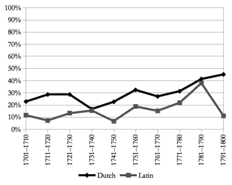
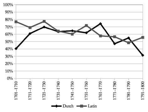
The present survey builds on the scholarship of Van Impe, Bos and others (as described above) by including an even more particular typographical features found on typographical title pages in a large number of monolingual Latin and Dutch-language editions16. The items studied derive from the stcv, the online bibliography for handpress books from the early modern period17. On 10 May 2017, the stcv counted 9,322 titles from the eighteenth century. Records with a known date and place of publication were selected, the latter being a location in the Southern Netherlands. To avoid confusion, editions with more than one imprint were discarded, as well as multi-lingual works. For pragmatic reasons, only bibliographic descriptions with a link to a digital image of a typographical title page were selected. For each language, Dutch and Latin, details from about 30 records per decade were entered. For late eighteenth-century Latin books, this was not always possible, which sometimes results in smaller samples and this sometimes caused somewhat idiosyncratic rises and falls in the graphs. Apart from the exclusions just mentioned, where possible all records in the stcv corresponding to the selection criteria were included. In total, the group of items studied consists of 583 typographical title pages of Dutch-language editions and 405 for Latin title pages (see Table 1).
Table n° 1: Number of editions surveyed per decade in Dutch and Latin
| Dutch | Latin | Dutch | Latin | ||
| 1701-1710 | 57 | 52 | 1751-1760 | 34 | 32 |
| 1711-1720 | 56 | 55 | 1761-1770 | 74 | 33 |
| 1721-1730 | 63 | 53 | 1771-1780 | 83 | 55 |
| 1731-1740 | 30 | 39 | 1781-1790 | 104 | 29 |
| 1741-1750 | 31 | 30 | 1791-1800 | 51 | 27 |
METHODOLOGY
For all but two typographical features surveyed, their presence or absence is represented by a binary value, i.e., either zero or one. For the sake of statistical comparison across languages and periods, those values can be added up, and can be recalculated as fractions or percentages. By contrast, the number of lines in the so-called title part (i.e., all text above the imprint) is recorded by a number ranging from 3 to 37, and the line of text appearing in the largest type is recorded in the same way, which in this survey is a number between 1 and 16.
Most elements surveyed fall into four large categories: type, lines and borders, other non-textual elements such as vignettes or special features, and the arrangement of paragraphs. In addition, information was included about the style of dates (whether in Arabic or Latin numerals), the use of red ink, the appearance of typographical discontinuity in the title, and the use of the epigraphical letter V representing U.
The first category concerns type. A distinction is made between the title part which appears above the imprint, and the text in the imprint, with the exclusion of the year of publication. Individual type faces, such as those cut by Johann Michael Fleischmann (1707-1768), Jacques-François Rosart (1714-1777), or others, have not been either measured or identified: for the purposes of this study, only their style is taken into consideration. The following styles are recorded as soon as they are identified in at least one word: roman (lower case), roman capitals, roman small caps; black letter; italics, italic capitals (or sloped caps), italic small caps; civilité ; financière, financière capitals; phantasy capitals and phantasy italic (sloped) capitals (Fig. 3). From this information, the total number of different styles appearing in the title-part and in the imprint is automatically derived. For both the title-part and the imprint, the use of red ink is indicated. For the title-part, it is also recorded which particular style is used in the highest number of words (regardless of the fount size, apart from cases where two styles appear in as many words, in which case the physical appearance is taken into account). This is recorded as the « dominant » type style. Also related to this category is the information about the number of lines of text in the title part, and exactly which line is printed in the largest type size.
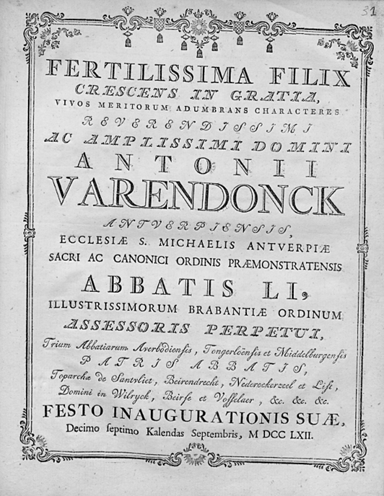
Figure n° 3: Fertilissima filix crescens in gratia [...], Antwerp: Joannes Grangé, (1762): title page displaying phantasy capitals (line 1), italic phantasy capitals (line 2), roman capitals (line 3), financière capitals (line 4), financière (lines 14, 16-17), and roman lower case (last line).
The year of publication in the imprint is dealt with separately18. Arabic numerals are distinguished from Latin dates, and for the latter, it is recorded whether upright as opposed to sloped capitals are used, as well as the appearance of small caps, and dots in between the letters, and attention is also paid to the special forms of the Latin figures « M » and « D » (see Fig. 11 and 12, p. 331).
The second category pertains to the appearance of horizontal lines on the title page and also of borders. Single, double and triple horizontal lines, irrespective of their thickness, are noted (see Fig. 1). Horizontal lines composed of individual fleurons and braces are counted separately as well. The appearance of borders is recorded, and a distinction is made between borders consisting of (thinner and thicker) lines and those constructed with fleurons or ornaments (see Fig. 3).
The third category deals with the appearance of non-textual elements appearing between the title-part and the imprint: printer’s devices, vignettes, coats of arms, illustrations and mere ornaments or fleurons19. Related to this category is also the use of single vine leaves, paragraph marks, fists and triangles on the title page.
The fourth category deals with the shape of paragraphs (Fig. 4). A distinction is made between indented and outdented paragraphs. Lines of text within a paragraph can be ragged right, justified or centred. Paragraphs with special shapes are recorded, as well: paragraphs arranged as (truncate) triangles, or in the shape of the upper part of a chalice. In this case, a distinction is made between those paragraphs that echoed the shape of drinking glasses used especially in Germany and the Netherlands from the fifteenth century onwards, known as Berkemeyers and a Rummers. Both consist of at least the centred and tapering lines which are laid out in a such a way that their form seems to form an oval at the bottom. Rummers have at least two lines at the top spanning the entire width of the text area, as opposed to Berkemeyers which have only one. Finally, so-called « floating » paragraphs are recorded. This type of paragraph may consist of a single line or multiple lines which do not span the entire width of the text block and which are not laid out symmetrically around the horizontal centre axis of the type area. Floating paragraphs usually consist of citations, e.g. from the Bible, and appear often more to the right of the center of the type area (see the citation on the title page of Fig. 1).
Finally, attention is also paid to cases where words are split up at the end of a line, and, when this occurs, whether the second part of the hyphenised word appears in a different size, type style or colour from the first part, a phenomenon known as typographical discontinuity20.
RESULTS
Red ink
If red ink is used on the title page, it is usually combined with black ink. In the stcv, multi-colour typographical title pages remain fairly rare: they feature just 864 times in seventeenth-century descriptions and 466 times in those for the eighteenth century, which is 6.7% and 5.0% respectively21. For the editions in the corpus, those values are higher: 20.7% for Latin editions and 6.7% for Dutch-language works. On 26 title pages, red is the dominant colour.

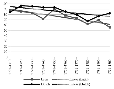
Graph 1 : Number of different type styles in the title part (nLatin = 405, nDutch = 583)
When red appears in the title-part it usually appears in the imprint as well22.
Type styles in the title-part
On average, Dutch-language titles consist of 3.6 different type styles as opposed to 3.2 for Latin. The difference is not related to the use of black letter or civilité, two kinds of type appearing only on Dutch-language title pages, because black letter is recorded only 13 times and civilité only once23.
As described elsewhere, the number of different types on Dutch-language title pages increased from 1 in the 1540s to about 2 some thirty years later and to 3 at the beginning of the seventeenth century. Between 1631 and 1640 and the end of that century, the average number of different type styles fluctuates between 3.4 and 3.1 in the period 1691-170024. Graph 1 indicates the evolution for the eighteenth century.
Graph 2: Appearance of roman type (lower case) in the title part, in percentages.

Graph 3 : Appearance of italics (lower case) in the title part, in percentages
Words set in roman capitals appear in all Dutch-language and Latin titles. Second and third in quantity are roman (lower case) and italics (lower case). All three type styles appeared frequently on title pages in the Dutch language from the 1650s onwards25.
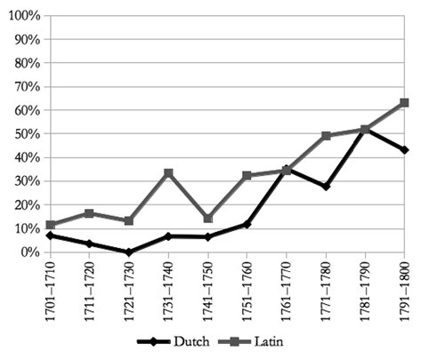
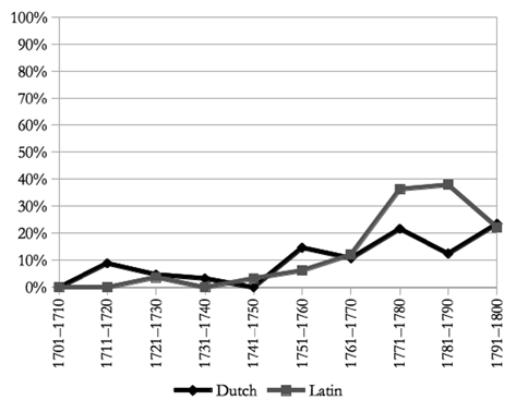
The preference for words in roman type is more or less clear for both Dutch and Latin titles (Graph 2). This type style is present in about 90% of the cases at the beginning of the eighteenth century, and it gives way only slowly towards the end, more so for Latin titles than for Dutch ones.
For italics, the graphs are more idiosyncratic (Graph 3). Depending on the period, the numbers go up or down again, for Dutch titles somewhere between 56.1% at the beginning of the period, up to 100% in the 1730s, but considerably less again a decade later (77.4%). The appearance in Latin titles is less important, from 73.1% at the beginning of the period to 59.3% at the end of it, with a rise in the 1770s (80%). In general, the preference for Latin works is in any case going down, and for those in Dutch it is continuing to rise, but the differences between decades remain important.
Roman small caps begin to appear in the 1560s, and are found on about 20% to 40% seventeenth-century Dutch-language title pages26. In the eighteenth century, roman small caps are present in the title-part on 20%-51% of the title pages (Graph 4). They are more frequent in Dutch-language titles (on average 35.8%) as opposed to Latin works (25.4%). In both languages, the general trend is a decreasing one, with a few rises and falls on the way.
Italic or sloped capitals were in only fairly limited use on seventeenth-century Dutch-language title pages, from less than about 5% to about 10% in the 1690s27. Their use decreases for Dutch-language titles in the 1710s and then rises thereafter constantly until the 1780s (Graph 5). More or less the same trend is apparent in the case of Latin works, for which this type style reaches its lowest point two decades later, in the 1730s, but then gains in importance after that period to reach the same levels as for Dutch-language titles in the second half of the eighteenth century. In comparison to the first half of the century, the presence of italic capitals doubles in the second half for both languages: it increases from 23.2% to 50.8% for Dutch-language titles, and from 25.7% to 50.5% for Latin.
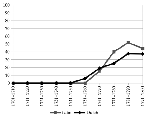
In the second half of the eighteenth century, new type styles also begin to appear. Phantasy capitals are used for the first time in 1759 in titles of Dutch-language editions (Graph 6)28. From the 1750s onwards, this type style appears in Latin titles, too, and in the 1780s the frequency of their use goes up to 51.7% in Latin titles and 37.5% in Dutch-language titles. A variant style, sloped phantasy capitals, is found in the corpus for the first time in 176229, and their use increases to 18.3% for Dutch-language books in the period 1781-1790, and 11.11% for Latin titles a decade later (Graph 7).

Graph 4: Appearance of roman small caps in the title part, in percentages

Graph 5: Appearance of italic capitals in the title part, in percentages.
Two more special type styles begin to appear from 1759 onwards: financière and financière capitals, but both styles are fairly sparingly used: the former only five times and the latter only once30.
Graph 6: Appearance of phantasy capitals in the title part, in percentages.

Graph 7: Appearance of sloped phantasy capitals in the title part, in percentages.
Although the use of financière is very limited, it is probably no coincidence that it appears first in Dutch-language titles, because phantasy types begin to appear in this language first, too.
Dominant type styles in the title-part
Another way of looking at type styles in titles is to determine the one type style that is used for the greatest number of words. In the case of even numbers the most prominent type style is selected. The elegance of this technique is that it is clear and simple, and that it returns only one so-called dominant type style per edition.
For both Latin and Dutch-language titles, there are only three important dominant type styles: in order of importance, they are roman (lower case: 419 cases), roman capital letters (361), and italics (lower case: 193 cases)31. Table 2 lists the percentages per language.
In almost half of the Dutch-language titles, roman type is used for the greatest number of words. Roman capitals are dominant in about one quarter of the titles.
For Latin titles, it is exactly the other way round: in one in two cases, roman capital letters are dominant, and roman type in about one third of the titles.
Table n° 2: Dominant type style in Dutch and Latin titles, in percentages.
| Dutch | Latin | |
| Roman | 48.5% | 33.6% |
| Roman capitals | 26.2% | 51.4% |
| Italics | 23.8% | 13.3% |
| Other | 1.4% | 1.8% |
Type styles in the imprint
Four type styles are important in imprints: roman (lower case), roman capitals, roman small caps and italic capital letters. On Dutch-language title pages, black letter (11 cases), italic small caps (5), financière (1) and phantasy capitals also appear in imprints. The latter type style is used 7 times in imprints of Latin books, and the italicised version of phantasy capitals twice.
Roman type appears in almost all imprints on Dutch-language title pages throughout the entire period (94.3%, Graph 8). It is also the most important type style in Latin imprints (76.3%), but the average number drops from 89.0% in the first half of the century to 45.4% in the second half.
In both languages, the use of roman capitals decreases slowly, especially from the 1760s onwards (Graph 9). The graph plotting the appearance of roman small caps is full of irregularities, but all in all, the trends for their use in both Dutch and Latin show slight decreases (Graph 10). From the 1750s onwards, italic capitals become more and more important (Graph 11). While their use at the beginning of the eighteenth century is still very modest (about 12% for Latin and 7% for Dutch), by the 1770s, this level has tripled and by the end of the century, italic capitals are present in 43% of Dutch-language imprints and in 63% of the Latin ones.
Graph 8 : Appearance of roman type (lower case) in the imprint, in percentages.

Graph 9 : Appearance of roman caps in the imprint, in percentages.
The use of black letter in imprints on vernacular title pages is closely connected with the use of this type in titles : in nine cases, it appears in both title and imprint. Moreover, there is a clear link here with devotional text genres, religious and spiritual texts, including, for example, copies of the New Testament, sermons by German mystic Johannes Tauler, prayer books, a catechism, devotional works for the consolation of the soul, and the devotional travel book to Jerusalem by Jan van der Linden.

Graph 10 : Appearance of roman small caps in the imprint, in percentages.
Graph 11 : Appearance of italic caps in the imprint, in percentages.
In contrast, the use of italic small caps in imprints is specific to one printer only. In all five cases found in the corpus, it is used to highlight the name of the Bruges printer Cornelis de Moor i, who was active between 1766 and 1791. Before 1784, he printed his own name either in roman type (lower or upper case), or in italics (lower or upper case), but between 1784 and 1788, it appears a couple of times in italic small caps32. A systematic survey of all title pages from this period has yet to confirm whether this habit was specific to him only. In any case, it was certainly not an attempt on his part to « brand » his title pages, because in more than 90% of them, De Moor uses other styles to print his name in the imprint.
Graph 12: Roman figures used in imprints to indicate the year of publication, in percentages.
Financière (lower case) and phantasy letters (lower or upper case) are seldom used, and they appear in the corpus only between 1751 and 1790, mainly in imprints of school editions of the classics published by the Brussels Royal Academy33. Their appearance on title pages, in either titles or imprints, can therefore be used to help date undated works.
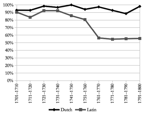
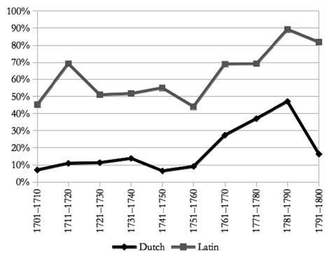
The year of publication in the imprint can be rendered as an Arabic number or with Roman numerals. Not surprisingly, the latter method is more favoured on Latin title pages. Until the 1750s, about 53.6% of the Latin imprints bear a year of publication in Roman numerals (Graph 12). From the 1760s onwards, this share increases sharply and peaks in the 1780s (89%). In the period 1761-1800, three out of every four Latin works bear a year in Roman numerals.
This rise after 1760 is paralleled in Dutch-language books from the Southern Netherlands. Whereas only approximately 9.7% of the editions have Latin years of publication in the imprint before 1760, this share increases to 47% in the 1780s, dropping again dramatically in the last decade of the century. Typographers clearly changed their habits in the second half of the century for books in both languages. This seems to be a fashion which was popular for some 40 years and which faded again thereafter.
The Roman numerals M, D, C, X, V and I are printed in roman capitals in about 90% of the cases. In 31 dates, italic capitals are used (8.9%), and in only 10 cases, small caps. In three imprints special variants for M and D appear, consisting of brackets with a straight line in the middle : ( | ) and | ). The first time this occurs in the corpus is in an edition of Petrus Divaeus’ Opera varia published by the Louvain printer Henricus van der Haert in 175 734. Two more examples are found on title pages of books published by the Louvain Typographia academia, both in 176135. The first book is an edition of the Institutionum libri quatuor by the Byzantine jurist Theophili Antecessoris, and the second one also deals with legal matters and bears the title Juris civilis compendium autoris incerti. No other imprint between 1759 and 1797 of the Louvain Typographia academia bears this feature36.
Horizontal lines and borders
Horizontal lines on title pages probably begin to appear in the Southern Netherlands in the 1530s37. In the ensuing years, this feature is increasingly used. Often the horizontal line is placed just above the imprint or in between lines of text of imprints. Until the eighteenth century, this separator appears as a single horizontal line, but its shape begins to change from the second decade of the eighteenth century onwards, and from 1771 onwards, horizontal braces are sometimes used to perform the same function.
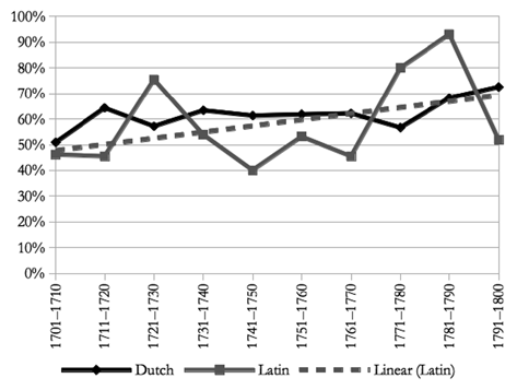
At the beginning of the eighteenth century, horizontal lines of various types are present on half of the typographical title pages in the corpus. This proportion rises steadily for Dutch-language books up to 73% by the end of the century (Graph 13). The numbers for Latin editions increase from about 46% in the period 1701-1710 to 52% in the last decade of the eighteenth century. The numbers for Latin are much more capricious, which is probably due simply to the fact that the corpus contains lower numbers for books in this language, which is only to be expected, since total numbers of books printed in this language was generally decreasing over the course of the century. But, as the trend line on the graph indicates, the general pattern here is very similar to that for Dutch-language books. This pattern is also reflected in the following three graphs (Graph 14-16).
Graph 13 : Horizontal lines or braces on title pages, in percentages.
The style of horizontal lines begins to change in the 1710s and 1720s, when lines constructed of small fleurons and double horizontal lines begin to replace simple lines (Graph 14). Often, a double line consists of one thicker and one thinner line. They gain more in importance in the second half of the eighteenth century, appearing on one in five of the Dutch-language and Latin title pages studied combined (Graph 14). Ornamental lines are on the increase from the 1750s onwards and they reach levels of 20% and over in the last three decades of the eighteenth century in both languages (Graph 15).
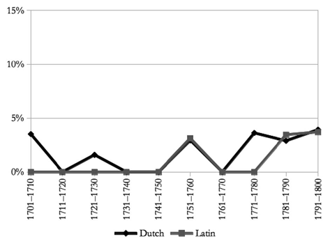
Triple horizontal lines are rare: in fact they appear only nine times in the corpus, between 1766 and 1798. Horizontally placed braces are not much more frequent, with only 13 appearances between 1771 and 1794. Despite their rarity they are nevertheless worthy of consideration, as they can be used as a terminus post quem.
The increase of double and ornamental horizontal lines runs parallel with a more intensive use of borders on title pages (Fig. 3). Until 1750, their appearance is fairly modest, but it increases in the second half of the eighteenth century (Graph 17). In the 1760s, one in three Dutch-language books bears this feature. A decade later, its use diminishes again, only to pick up again in the final years of the century. As with many other typographical features, the increases and decreases of the use of ornamental horizontal lines in the Latin books studied are more extreme, but this is probably the result of the relatively smaller samples for the periods 1741-1770 and 1781-1800.

Graph 14 : Single horizontal lines on the title page, in percentages.
Graph 15 : Double horizontal lines on the title page, in percentages.
The design of borders changes in the sixth decade of the century. Before 1761, the majority of the borders consist of straight lines which form a box around the text on the title page. From 1761-1770 onwards, there is an important increase in the use of fleurons and ornaments to compose more complex and distinct designs (Table 3). In general, borders appear more often on Dutch-language title pages than they do on Latin ones (15.6% as opposed to 8.1%).
Graph 16 : Ornamental horizontal lines on the title page, in percentages.

Graph 17 : Borders on the title page, in percentages.
Table n° 3 : Number of editions per decade with borders consisting of lines or of fleurons and/or ornaments.
| Lines | Fleurons/ornaments | Lines | Fleurons/ornaments | ||
| 1701-1710 | 4 | 0 | 1751-1760 | 6 | 5 |
| 1711-1720 | 2 | 2 | 1761-1770 | 5 | 31 |
| 1721-1730 | 3 | 0 | 1771-1780 | 5 | 24 |
| 1731-1740 | 3 | 1 | 1781-1790 | 1 | 17 |
| 1741-1750 | 3 | 0 | 1791-1800 | 8 | 19 |
Other non-textual features on the title page
In this section I will discuss five other types of non-textual elements, which, if they are present, are found in the middle of the title page between title and imprint: printer’s devices, vignettes, ornaments, coats of arms, and illustrations.
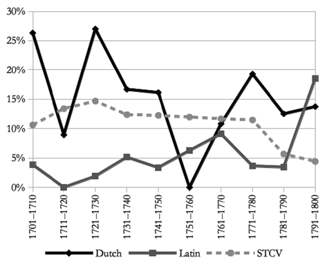
In the Southern Netherlands, one of the earliest printer’s devices is found on atitle page of an edition published by Dirk Martens in 151538. Until the 1530s, their use remains fairly limited39. From then onwards, printer’s devices are increasingly used and they are found in about one in four editions published between 1541 and 1700; gradually, however, this feature becomes less and less important40. In the STcv, the appearance of printer’s devices reduces gradually from the 1710s onwards, from about 17.4% in 1711-1710, to as little as 1.9% by the end of the century. In the corpus, only 43 books have a printer’s device on the title page (4.4%). Latin books very much tie in with the overall trend of all editions combined, while printer’s devices are somewhat less used on Dutch-language title pages, especially during the first four decades of the century (Graph 18).
More important in quantitative terms are coats of arms, appearing on 110 title pages in the corpus (11.1%), more often in Dutch-language editions than in Latin books (91 versus 19 cases). The ups and downs of the lines on the graph are not very relevant, because they pertain only to a handful of cases (Graph 19)41.
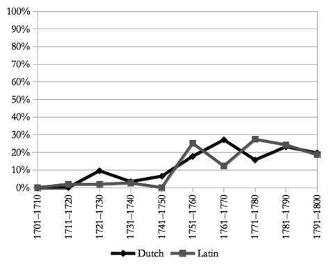
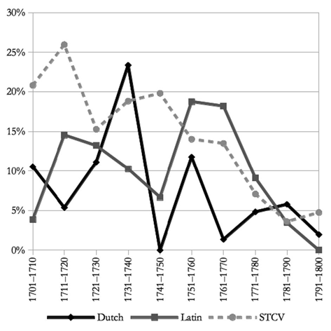
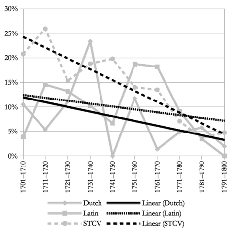
Broadly the same applies to illustrations on title pages. Illustrations are not simple embellishments, but contain a clear link with the content of the publication. Ifa woodcut engraving depicting flowers appears on the title page of a travel guide, it is more likely to be an ornament, while the same image can be a true illustration when the book at hand deals with flowers. Illustrations on title pages appear in 9.8% of all eighteenth-century editions currently in the STcv, and in 8.1% of all cases in the corpus42. Here too, peaks for Dutch-language and Latin editions seem to vary widely, but, again, this is due to the relatively small numbers (Graphs 20-21). All in all, one can state that for all three series the use of illustrations on title pages diminishes gradually (compare the graph with linear trendlines for Dutch, Latin, and stcv).

Graph 18 : Printer’s devices in the corpus and in stcv, in percentages.
Graph 19 : Coats of arms in the corpus and in stcv, in percentages.
It should be noted that a distinction was made between vignettes and fleurons on the title page. This is because vignettes are produced as woodcuts or metal cuts, which were mounted on a piece of wood to be printed simultaneously with type in relief, just like woodcuts. In contrast, fleurons are executed in lead like letter, and usually depict smaller ornaments, which can be used alone or in combination with the same or other fleurons to embellish the title page. For both Dutch and Latin title pages, the use of vignettes decreases between the beginning of the century until it reaches the lowest point in the 1770s, whereafter — curiously — they become more popular again. In the first decades of the eighteenth century, the difference here between Dutch-language and Latin books is important, with the latter having twice as many vignettes in the period 1701-1710 (77% on Latin title pages as against 37% on Dutch-language ones, Graph 22). The difference between the two languages gradually disappears, and in the period 1771-1780, Latin books have vignettes on their title pages in 24% of cases against 22% for Dutch. In the last decade of the century, those numbers have risen again to 44% and 47% respectively.
Graph 20 : Illustrations in the corpus and in stcv, in percentages.
Graph 21 : Illustrations in the corpus and in stcv, in percentages, showing trend lines.
The increase of the use of fleurons on title pages is remarkable. Until 1750, they appear in 12.9% of cases, and much more frequently on Dutch-language title pages than on Latin ones (18.6% against 7.0%, Graph 23). In the second half of the century, fleurons appear on 44.6% of all title pages in the corpus, while the difference between the two languages has disappeared (Dutch 46.5%, against Latin 40.9%)43. In the period 1751-1760, fleurons appear on almost six out of every ten Dutch-language title pages, and this level is reached by Latin books as well, twenty years later. During the final decade of the century, their use is halved (25.5% for Dutch-language and 22.2% for Latin title pages).
Special attention was paid to four traditional types of fleurons, which were recorded separately and were not included in the numbers cited above. Those are printed paragraph marks, single vine leaves, little triangles, and fists.
Printed paragraph marks begin to appear in publications of the Southern Netherlands in the period 1483-1484 as an alternative to this kind of navigation feature being added by hand by a rubricator in red or blue44. Over a period of about twenty years, they appear in virtually all Dutch-language books and in about 85% of all Latin books produced in this part of the world. But when typographers begin to exchange black letter type in Latin editions for roman type to print the main text, the use of printed paragraph marks systematically diminishes again to disappear almost completely by the 1550s45. The same happens in Dutch-language editions in the second half of the sixteenth century, and by the beginning of the seventeenth century, printed paragraph marks have almost completely disappeared on Dutch-language title pages as well46. This feature no longer appears in the corpus of 988 eighteenth-century title pages.

Graph 22 : Vignettes on the title page, in percentages.

Graph 23 : Fleurons on the title page, in percentages.
This is also the case for little triangles, which are often found in combination with single vine leaves on title pages and in titles of sections within books. This typographical element first appears in 1518 on title pages and elsewhere in the book47. After that date, it is frequently found, in fact in about one in five books, or more, and predominantly in Latin books and editions printed in ancient Greek (70% to 80%)48. Little triangles fall into disuse in the second half of the sixteenth century and no longer appear in the following centuries.
The earliest known single vine leaf fleuron was cut by Erhard Ratdolt in Augsburg in 1505, and imitated fairly quickly by other punchcutters49. Its use spread like wildfire. In the Southern Netherlands, it can be seen in a design by Peter Schoffer ii from 1518 onwards in editions published by Dirk Martens in Louvain50. In the 1520s, about 37% of books featured a single vine leaf on their title page, and in the period 1531-1540, about 38%, but first and more frequently in Latin than in vernacular books51. In the 1540s, this feature is beginning to be less used in Latin editions and ten years later, it starts to be less used in Dutch-language books as well. By the 1590s, it is almost completely gone. In the seventeenth century, it is found only very occasionally52. In the eighteenth-century corpus, under consideration here, it appears only once53.
Finally, a printed manicule (« little hand », showing a hand with a pointing finger, also known as a « fist ») appears on one title page in the corpus only. It is a theatre play published by the Bruges printer Andreas Wydts (active 1711-1749), who highlights a Latin and a Dutch chronogram in verse with two pointing hands. Before printing in relief with moveable type was developed in the west, manicula were commonly added in the margins by readers54. In the printing era, they begin to appear in the 1520s. Unlike printed paragraph marks or single vine leaves, printed fists are not abundantly used55. As was the case with little triangles and single vine leaves, the use of fists decreases in the second half of the sixteenth century and disappears altogether in the seventeenth century.
Paragraph design in the title
The title-part of typographical title pages consists of a number of text lines, three or more, and contains, in certain exceptional cases, as many as 30 or more lines of text. Latin titles consist on average of 13.6 lines as opposed to 14.1 lines in the case of Dutch-language titles. Those lines can be designed coherently, e.g., centred on a vertical axis, or otherwise. The most frequent designs are represented in Figure 4.
In a quarter of the items in this study, the entire title is designed coherently according to one particular style, and is in most cases centred on the page. In 78% of the Dutch titles and 76% of the Latin titles, two different paragraph designs are combined. Most of the time, centred paragraphs appear together with outdented paragraphs. These paragraphs have a first line which spans the entire width of the text area, with the following lines being indented but also justified on the right hand side. 18.0% of all Dutch titles mix three styles, Latin titles do so in only 13.3% of cases, and a very few combine four or even five different paragraph designs (Table 4).

Figure n° 4 : Main paragraph designs on title pages.
Table n° 4 : Number of different paragraph designs in the title of Dutch-language and Latin editions.
| Dutch editions | Latin editions | |
| 1 paragraph style | 583 | 405 |
| 2 paragraph styles | 455 | 308 |
| 3 paragraph styles | 105 | 54 |
| 4 paragraph styles | 5 | 2 |
| 5 paragraph styles | 1 | 0 |
In the eighteenth century, in 89.0% of the cases studied, the first title paragraph is centred, and in 10.5% of these, the first paragraph is designed in the shape of a Berkemeyer (Fig. 4, bottom left ; Graph 24). Only four titles in the corpus contain paragraphs in a Rummer shape (Fig. 4, bottom right)56.
Centred paragraphs, as a first paragraph in the title or elsewhere, are omnipresent (59.9%). At the beginning of the century, there is an important difference in the use of centred paragraphs between the two languages (Graph 25). In both vernacular and Latin titles, their appearance lessens towards the end of the century (40.4% for Dutch as opposed to 76.9% for Latin titles) 57. In contrast, justified but outdented paragraphs appear more frequently (Graph 27). The trend is only curbed in the last decade of the eighteenth century for Latin titles, when only 3 out of 27 titles contain at least one outdented paragraph.

Graph 24: First paragraph in Berkemeyer shape, in percentages.

Graph 25: First paragraph centered, in percentages.
Indented paragraphs, which are generally justified, are rare. The entire corpus contains only 3 examples for Latin titles and 12 more for Dutch-language titles. So-called floating paragraphs, which are not centred or justified, and which are not calibrated on the central vertical axis of the type area are uncommon, too (Graph 29). They appear twice in the 1710s on vernacular title pages, and then again in the 1770s and the following decades. In most cases, the information in the floating paragraph consists of a motto, or, even more frequently, of a citation, which is visually emphasized by its unusual arrangement on the page. This technique is continued at the beginning of the nineteenth century, too.
Graph 26: Outdented paragraphs in the title, in percentages.
Graph 27: Berkemeyer shape in the title, in percentages.
Finally, two more features were surveyed : the phenomenon of typographical discontinuity, and the use of the letter V in lieu of U58. Typographical discontinuity was surveyed only on word level, and found in only one instance59. In this case, the first part of the word « brande-wyn-accysen » [brandy taxes] is printed on one line, with the rest of the word on the following line. The design is described as discontinuous, because the second part of the word is printed in larger type, emphasizing the meaning of « assysen » [taxes]. This being the only case in the entire dataset, it can be safely stated that this phenomenon, which became popular at the beginning of the sixteenth century, and which from the 1540s onwards began to lose ground, had completely fallen out of use two centuries later60.
Graph 28 : Indented paragraphs in the title, in percentages.

Graph 29 : Floating paragraphs in the title, in percentages.
This applies to the use of the epigraphic letter V in lieu of U, as well. In Latin titles, the letter U is often represented by a V, for instance in the word « OPVS », as it would appear in epigraphy (for « OPUS », Latin for «work»).
Between 1601 and 1655, a V was used in lieu of U in Latin words on title pages in about 70% of the cases, but from then onwards, this practice started gradually to fall in disuse. By the end of the seventeenth century, only 11% of Latin words with a U were still printed with a V. Dutch words on title pages printed in the Southern Netherlands have a V in lieu of U in about 15% to 21% of the cases until 1665, but then the decline starts with these, too, and by 1700, this phenomenon has completely disappeared. Therefore, it does not come as a surprise that the epigraphic V only appears on only five title pages in the eighteenth century : once in a 1704 Dutch-language title, and four times in Latin titles between 1773 and 1785.
SUMMARY
There are clear differences between early-eighteenth century title pages and those produced at the end of the century, and these differences are the result of long-term changes in a many typographical features. The number of different type styles increases slightly during this period, and more so in the case of Dutch-language titles rather than those in Latin. Three type styles dominate the entire century: roman capitals, roman lower case — which, over time, falls somewhat out of favour — and lower case italics. In addition to small caps (used mainly for names), use of italic capitals, is on the increase, in Dutch-language titles from the 1720s onwards, and in Latin titles two decades later. Sloped caps become important in the second half of the century. From 1751 onwards, new type styles are introduced: phantasy caps, and an italic version of those a decade later, and financière, which appears for the first time in 1759. Each of these special types appears on Dutch-language title pages before it does on Latin ones. Civilité and black letter are found, in very small quantities, only on vernacular title pages, and in the case of black letter, there is an obvious connection with religious content. In terms of numbers, three type styles dominate titles: roman type (lower case), roman caps and italics; the first and third styles mentioned are both more prominent in Dutch-language titles.
Imprints, which usually consist of a place of publication, a name of a printer and a year of publication, are typically much shorter than titles and therefore display fewer different type styles. In order of frequency, roman lower case, roman upper case and roman small caps are the most important ones. Italic caps are also frequently used and become more important from 1761 onwards. Other styles are rarely used; black letter appears only on a very limited number of vernacular title pages, and sloped small caps are found in only five imprints of one publisher, the Bruges printer Cornelis de Moor i. Exotic types, such as financière and phantasy letters sometimes appear in imprints between 1751 and 1790, mainly in editions published by the Brussels Royal Academy. The year of publication frequently appears on Latin title pages in Roman numerals, and in both Latin and Dutch-language imprints, this increases noticeably from 1761 onwards.
The mere frequency of the appearance of lines and braces increases in the course of the century. Single horizontal lines are to some extent exchanged for ornamental horizontal lines from the 1750s onwards and for double lines a decade later. Triple lines appear in 1766, and five years later, horizontal braces become fashionable. In the period 1761-1770, more title pages are embellished with borders composed of fleurons or other such ornamental elements.
Over the course of the century, ever fewer printer’s devices, ever fewer illustrations, and ever fewer coats of arms appear on title pages, although the latter seems to increase for Latin works. In the second half of the century, the number of title pages with vignettes decreases in favour of fleurons, which are increasingly used on Latin title pages from the 1740s onwards, and, a decade later, on vernacular title pages, too.
Many titles are composed of two or three different paragraphs with different styles, the majority of which are centred on the page. Second in quantity are paragraphs arranged as Berkemeyers, but this style loses ground in the course of the century, while the use of outdented justified paragraphs becomes more frequent. In the 1770s, citations begin to appear in so-called floating paragraphs.
As a result of all these changes, title pages from the first half of the century and those conceived of after 1750 can be clearly distinguished. The preference for more sloped type styles (especially of caps and small caps) and the introduction of new type styles such as phantasy letters, in both titles and imprints, in combination with ornamental, double and triple horizontal lines, braces, and the use of fleurons instead of vignettes, change the overall appearance of title pages. An increase in years of publication being printed in Latin figures is also typical for the second half of the century, while the use of floating paragraphs is linked to the period 1771-1800. In addition to these features, there are also other important elements which have not been taken into consideration here: for example, in the last quarter of the eighteenth century new types, with small x-heights, are introduced, and types with straight and sharp serifs also come into fashion (e.g. Didot, and Bodoni). Furthermore, in the « age of reason », spelling underwent important changes. Both these elements require more research.
Differences between title pages of Latin and of vernacular editions are limited; the convergence of the layout paradigms in the seventeenth century is not followed by a new divergence a century later.
DAMNED USURY, « COLOGNE », « 1715 »: DELUSION OR BONA FIDE ?
It is now time to return to the enigma which provoked this survey. Den verdoemelyken woeker is printed according to a design commonly used in the Southern Netherlands in the late eighteenth century. Indeed, clearly it was the Southern Netherlands: all the facts point in this direction. Judocus Raben is totally unknown to the vd18, the Verzeichnis der im deutschen Sprachraum erschienenen Drucke des 18. Jahrhunderts, as are the keywords «woeker» or «woecker», and the author Gillis61. The title page is executed in black ink only and displays three different type styles in the title : roman capitals, italics and roman lower case. All three cases are commonly used on Dutch-language title pages throughout the eighteenth century. The imprint has three different styles, too: roman upper case, roman lower case, and roman small caps. The year of publication is printed in Arabic numerals. This, too, is perfectly in step with eighteenth-century imprints. Between the title and the imprint, there is an image of a head surrounded by rays of the sun which was probably executed as a single fleuron, not as a woodcut vignette or metalcut. All but one paragraph is centred onto a vertical axis. The citation from the Second Epistle of Paul to Timothy in the New Testament (Ad Timotheus) is placed between two horizontal, single lines and placed to the right as a floating paragraph. This feature, in combination with the fleuron, points in the direction of a late-eighteenth century design. And so does the specific design of the titling letters of the word « Woeker » on the third line : the difference between thick and thin lines, for instance in the letter « O », is rather modern because they run perfectly horizontal and vertical, and the straight serifs which are obvious in the letter « K» appear similarly modern in design (see Fig. 6).
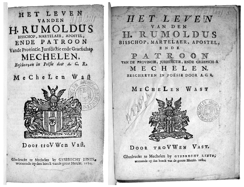
If this is indeed a late eighteenth-century, or even more recent publication, where does the date 1715 come from, in the imprint and in all three approbations at the back of the booklet ? I suspected that there may have been an actual 1715 model and in fact I managed to locate one fairly quickly through a search in the Karlsruher Virtueller Katalog, copies of which were listed only as being in Belgian institutional libraries. I therefore went to consult a copy which was held in the Antwerp Hendrik Conscience Heritage Library (see Fig. 5).
The original edition has a title page that complies with all the features typical of a 1715 Dutch-language title produced in the Southern Netherlands, including the citation in a paragraph in Berkemeyer shape and a woodcut vignette between title and imprint. In addition, the design of the titling letters also seems typical of contemporary type62. Study of both editions side by side reveals how close to the original the later edition is ; spelling is obviously modernized, but otherwise this edition is a word by word true reprint. The absence of the long « s » in the reprint proves that the date is later than 179063.

Figures nos 5 & 6: Original title page of Den verdoemelycken woecker and its reprint.
A comparison between the first page of text of the work in both editions supports these findings (see Fig. 7). An ornamental border composed of fleurons is replaced by a double horizontal line, which particularly on title pages appears more regularly from the 1750s onwards. The worn-out, ornamental woodcut initial of the word « Den » is substituted by a simple large initial which sticks out above the first text line. Although such capital letters sticking out at the beginning of a section can be spotted in French books published in the seventeenth century, in the Southern Netherlands this design feature remains rare until the late eighteenth century.

Figures nos 7 & 8 : First text page of Den verdoemelycken woecker in the original edition and in the reprint.
The fleuron on the title page, the floating paragraph with the citation, the double horizontal lines and the large initial capital letter which sticks out above the text in combination with the modernized spelling and the absence of the long « s » suggest the end of the eighteenth century as a terminus post quem. The fact that the later edition was printed with a handpress on laid paper points to a terminus ante quem around 1850.
Thus far, I used neutral terms to refer to the later edition, because it remains open for discussion as to whether we are dealing here with a late piracy or with a facsimile. The fact that the reprint reproduces the original edition word for word, including all the paratexts, results in a peculiar and ultimately anonymous publication. At least three different reasons can explain this. Firstly, the publisher may have wanted to hide her or his identity to avoid criticism or persecution, for instance because (s)he was publishing a forbidden text or a text for which somebody else still had the rights. Secondly, the use of a false imprint in combination with a fictitious past year of publication may have been done in order to help raise the interest of potential buyers and readers. Thirdly, the publisher may simply have intended to produce a true « facsimile » of a text which had been out of print64.
The hypothesis of a facsimile is less unlikely than it may seem at first sight. A case with similar characteristics was discovered in the course of the systematic description of the holdings of the library of the Mechelen City Archives 2008-201065. In the course of this work, two editions that were textually identical but with different layouts turned up of a particular publication, which was a book about the life of the local saint Rumbold by the poet Augustinus Casimir Redelius («A.C.R. »), Het leven vanden H. Rumoldus [...] patroon van [...] Mechelen, with one in octavo and the other in duodecimo format66. Both presented themselves as products of the workshop of the Mechelen printer Gysbrecht Lints, but in reality only the octavo edition is his. The quarto edition cannot have been Lint’s work, because it displays type faces on the title page which had not been in use before about 1759, such as the shadowed caps used for the words « h. rumoldus » and the phantasy caps in the word « patroon » (see Fig. 10).
The «facsimile» was actually published in 1774 by Joannes Franciscus vander Elst, active in Mechelen from about 1750 until 1785, together with four more facsimiles related to saint Rumbold. This we know through the prologue in another work published by Vander Elst, Beschryvinge der negen-hondert-jaerigejubel-feest van den H. Rumoldus [.] patroon van Mechelen, aldaer geviert in het jaer 1680 [Description of the 900th-year celebration of S. Rumbold [...] patron of Mechelen, celebrated there in 1680]67. Here Vander Elst explains that the 900th-year celebration should have taken place in 1675, but that it was postponed because of the wars between Spain and France. Vander Elst announces the reprint of five works published in 1680 in order to make them available again to the citizens of Mechelen who would like to get hold of them in preparation for the first millenary celebration in 1775. Copies of the original editions, he argues, have become very rare, and reprinting them not only supplies a need, but also helps to secure their preservation. All five reprints are preceded by the Description of the 900th-year celebration of S. Rumbold recounting the preparation of the jubilee. For convenience, he adds, the introductory text, as well as the reprints that followed, are printed in the same format68.
Obviously the underlying motive of the printer/publisher is a financial one, which explains his advertising for the collection of reprints in the local newspaper, Het wekelyks bericht voor de stadt ende provincie van Mechelen [The weekly news for the city and province of Mechelen], on 3 July 1774 :
By J.-F. Van der Elst, Boek-drucker ende Boeck-verkooper alhier, is gedrukt en te bekomen, de Beschryvinge der Neghen-hondert-jaerige Jubel-Feest van den H. Rumoldus, Bisschop ende Martelaer, misgaders Apostel ende Patroon van Mechelen, aldaer geviert in het jaer 1680, waer by gevoegt zyn verscheyde stucken, alsdan ter dier oorsaecke in het licht gegeven69.
[To be had at J.-F. Van der Elst’s, local printer and bookseller, who printed it, is the Description of the 900th-year celebration of saint Rumbold, bishop and martyr, as well apostle and patron of Mechelen, celebrated there in the year 1680, to which are added different pieces, then published on that occasion.]
In contrast to Het leven vanden H. Rumoldus, no such peritext or epitext has turned up yet explaining the publisher’s motives for the reprinting of Den verdoemelyken woeker. In both cases, nothing but the updated layout and spelling hold clues about the actual production date. But the reprint of Het leven vanden H. Rumoldus indirectly informs us about a contemporary publisher’s views on facsimiles avant la lettre (i.e., before the term had even been coined), which he clearly thought should be true to the original text and paratext, but not necessarily so when it comes to the application of the original bibliographic format or original layout features. These reflections thus leave open all possibilities for Den verdoemelyken woeker, which still may have been either a fake or simply a bona fide reprint.
Figures nos 9 & 10 : Title page of the 1680 edition of Het leven vanden H. Rumoldus by Gysbrecht Lints, and the title page of the 1774 « facsimile » published by Joannes Franciscus vander Elst in preparation of the millenary in 1775.
TOWARDS A DEFINITION OF « NEOCLASSICAL DESIGN »
In the second section of this article, I referred to Delsaerdt’s survey of the typographical design often used by Leuven University Press, which, he argues, in the first year of its existence tried to make its work stand out from that of its competitors through the application of a specific typographical design associated with emerging neoclassical aesthetics70. How, now, might those aesthetics be defined based on our survey of eighteenth-century title pages in the Southern Netherlands at large ?
The typographical characteristics which best represent this « neoclassical design » can be derived from the title pages cited in the article. The brief title (5 lines of text only) of the Theophili Antecessoris Institutionum libri quatuor, published by the Louvain Typographia Academia in 1761, displays only two different type styles : roman capitals and sloped capitals (Fig. 11)71. The imprint does likewise : it has roman capitals and roman small caps, followed by a year of publication in Roman figures. For « M » and « D » special variants are used. Both title and imprint are centered ; one could argue that lines 3 to 5 are deliberately designed in a Berkemeyer shape. The first line of the title is printed in the largest type size. The title page features no ornamental element, such as lines, borders, vignettes or fleurons. Therefore it is an example of what is called in French pure typographie.
The second example is also published in 1761 (Fig. 12). The title of the Juris civilis compendium is with its 6 lines of text barely longer than the other one72. This time roman caps are combined with roman lower case. Here the imprint is set out of sloped capitals and roman small caps, and here again the Latin year of publication has the special variants of « D » and « M ». The title paragraphs are centered, and in this case the second part of that title is clearly designed in a Berkemeyer shape. Here, the second line is printed in the largest type size. Furthermore, the title page is left bare.
The careful reader will have noticed that both designs show similarities as well as differences. If both title pages meet the requirements of a neoclassical design in the making, this means that there are options. Roman capitals can be combined with a second type style, roman lower case in the first case and roman small caps in the second. But what about italic capitals, or italics in lower case ? Could a combination of roman caps with any one of both result in a neoclassical design ? And how many different type styles can be combined: two, three, or more ? The imprint shows variation, too. In both cases italic small caps are used to print the name ofthe enterprise, and both imprints have the year ofpublication in Latin figures. Is this a mandatory feature ? And what about the use of the special « M » and « D »? In the corpus currently under consideration, there is only one other edition with this feature73. If this feature were essential for neoclassical design, it would stop the discussion here. Is it also a requirement that title paragraphs combine centred paragraphs with Berkemeyer shapes, or is a centred paragraph sufficient on its own ? Does it matter which line is printed in the largest type size ? Is there a limit to the number of lines that constitute the title ? And is any form of non-textual embellishment, however delicately executed, a priori excluded within the « neoclassical » paradigm ? The dataset contains eleven title pages without any embellishment, only two of them belong to Leuven University Press ; all editions in the dataset from this press published after 1761 have either a coat of arms or a fleuron or ornament on the title page.
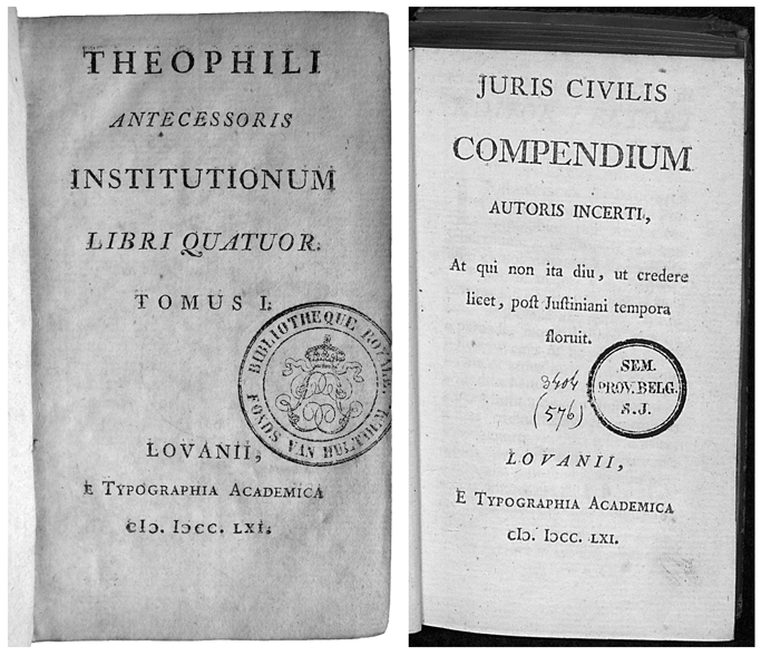
Figures nos 11 & 12: Title pages of two 1761 editions by the Leuven Typographia Academia.
These observations suggest that static definitions of design paradigms are doomed to fail. If the analyses of sixteenth-, seventeenth-and eighteenth-century title page design have demonstrated anything, it is that there is no one typographic element or feature — let alone a solid combination of multiple elements — left untouched by the dynamics of typographical evolution. I am not confident that there is such a thing as a « neoclassical typographical design », but, on the other hand, the second half of the eighteenth century does produce a new typographical design. In this design paradigm, there is a preference for italicized type and phantasy types. If there is any feature that could be connotated with « neoclassicism », it should be the use of Latin figures to print publication dates, which is clearly on the increase between 1751 and 1790. In the second half of the century, simple embellishments give way to more elaborate ones : double, triple and ornamental horizontal lines and braces replace single lines, and more and more complex borders appear on title pages. This period also displays a clear preference for fleurons where vignettes, printer’s devices or coats of arms used to find a place.
The data gathered for this survey clearly suggests the birth and development of a new design from the 1750s onwards, but it also seems to announce yet more new developments at the end of the eighteenth century.
Seen from a dynamic point of view, the Leuven academic press did not abandon its original intention to publish according to the new fashion; rather, it adapted its design according to general trends and changing habits in the course of the following years and decades. Neither was this publishing house unique. As far as title page design is concerned, it has much in common with the press of the Royal Academy in Brussels, which published a number of typographically distinguished school editions in the 1770s and 1780s.
CONCLUSION
With this survey of eighteenth-century title page design in the Southern Netherlands, a long-term project has almost come to a close74. Once again, it is demonstrated that title page design, like book design, continued to evolve. There is a clear difference between title pages from the first half of the century and the latter half. As in previous centuries, this is the result of an incremental transformation of several typographical features on the micro level, the accumulation of which results in recognisable designs on the macro level. New designs are the result of the combination of both design features which already exist, and new ones, the former often being used to different degrees in order to create a balance between old and new. Old elements, because title pages have to look familiar enough not to turn away buyers, and new elements, in order to stand out, to make a difference, and to raise buyers’ interest.
The new design which comes to the fore in the second half of the eighteenth century is marked by the use of new type styles, as well as more elaborate lines and borders, a preference for more italicized type styles, and also the use of fleurons to embellish title page. More often than before, dates of publication are printed with Roman figures. There is also a small shift in the use of paragraph arrangements, and the floating paragraph — a rococo twist ? — makes its entry at the end of the century. In combination with other clues, these typographical characteristics can be used to suggest a period of production for printed works from the Southern Netherlands which either lack dates, or which have dates of production that are dubious.
In addition to answering a number of questions, this survey also raises more of them. The concept of the facsimile avant la lettre as it was used in the eighteenth century requires more research. To what extent do they differ from the concept of mere reprints or copy imprints, which were already common in the seventeenth century and also existed earlier on ? And how does this concept develop into today’s concept of the facsimilé?
Then there is the concept of « neoclassical typography ». In this contribution, I suggested a more dynamic concept of a typographical design paradigm. In my opinion, there are enough clues to identify a typographical design typical of the second half of the eighteenth century (which, in turn, seems to shift again at the very end of that century), but how elastic can such a definition be before it becomes empty?
These questions beg for follow-up research in other geographical regions. In the eighteenth century, both France and the Dutch Republic constituted important centers of book production, and perhaps their typographical cultures should follow suit first.
____________
1 Compare with Philip Gaskell, A new introduction to bibliography, New Castle, Oak knoll Press, 2006, fig. 59, p. 101.
2 Tim Dankers, « Drukken met de lezer in het vizier. Een inhoudelijk-typografische analyse van pamfletten in dialoogvorm rond de Brabantse Omwenteling (1790) », De Gulden Passer 86, 2008, p. 115-150, with English and French abstracts on p. 150.
3 Pierre Delsaerdt, « Branding the revival of knowledge. Leuven University Press and the Renaissance of typography, 1759 », Quaerendo 45-3-4, 2015, p. 273-291.
4 Ursula Rautenberg, « Die Entstehung und Entwicklung des Buchtitelblatts in der Inkunabelzeit in Deutschland, den Niederlanden und Venedig. Quantitative und qualitative Studien», Archiv für Geschichte des Buchwesens, 62, 2008, p. 1-105. Especially pages 4-16 offer a critical account of one hundred year of scholarship on the title page.
5 Margaret McFadden Smith, The title-page: its early development, 1460-1510, London, British Library, 2000.
6 Alfred W. Pollard, Last words on the history of the title-page with notes on some colophons and twenty-seven facsimiles of title-pages, London, 1891 (reprint New York, Burt Franklin, 1971); Konrad Haebler, Handbuch der Inkunabelkunde, Leipzig, 1925 (reprint Stuttgart, Hiersemann, 1979), p. 115-132 ; Gustav Adolf Erich Bodeng, « Über die Entstehung und die Fortbildungen des Titelblattes », Das Titelblatt im Wandel der Zeit, special issue about the title page of the year book Buch und Schrift. Jahrbuch des Deutschen Vereins für Buchwesen und Schrifttum, 3, 1929, p. 74-94.
7 Peter M. H. Cuijpers, Teksten als koopwaar: vroege drukkers verkennen de markt. Een kwantitatieve analyse van de productie van Nederlandstalige boeken (tot circa 1550) en de « lezershulp » in de seculiere prozateksten, Nieuwkoop, De Graaf, 1998 (Bibliotheca Bibliographica Neerlandica 35) ; Yves G. Vermeulen, «Een schoon historie. De presentatie van Nederlandstalige literatuur 1477-1550: De titelpagina», Spektator 12-4, 1982/1983, p. 249-269; Yves G. Vermeulen, « Reclame op de vroegste Nederlandstalige titelpagina’s », Literatuur. Tijdschrift over Nederlandse letterkunde 1-4, 1984, p. 210-214; Yves G. Vermeulen, « Tot profijt en genoegen. » Motiveringen voor de produktie van Nederlandstalige gedrukte teksten 1477-1540, Groningen, Wolters-Noordhoff/Forsten, 1986.
8 Ursula Rautenberg, «Die Entstehung ... », op. cit. [note 4], p. 24, note 116.
9 For a number of case-studies, see La page de titre à la Renaissance, éd. Jean-François Gilmont & Alexandre Vanautgaerden, Turnhout, Brepols, 2008. See also Hubert Meeus, « Titelbladen van toneeldrukken in de Nederlanden vóór 1700», in E Codicibus Impressisque : opstellen over het boek in de Lage Landen voor Elly Cockx-Indestege, éd. Chris Coppens, Leuven, Peeters, 2004, vol. 2, 301-328 ; see also note 7.
10 Goran Proot, « De opmars van de romein. Het gebruikvan romein en gotisch in Nederlandstalig drukwerkuit de zuidelijke Lage Landen, 1541-1700 », Jaarboek voorNederlandse boekgeschiedenis, 19, 2012, p. 65-86.
11 Goran Proot, « Converging design paradigms : long-term evolutions in the layout of title pages of Latin and vernacular editions published in the Southern Netherlands, 1541-1660 », Papers of the Bibliographical Society of America 108-3, 2014, 269-305.
12 Goran Proot, «Converging design paradigms ... », art. cit. [note 11], p. 296.
13 R. A. Sayce, «Compositorial practices and the localisation of printed books, 1530-1800», The Library, 21, 1966, p. 1-45. A corrected reprint was published by the Oxford Bibliographical Society in 1979.
14 Frans A. Janssen, «Layout as a means of identification», Quaerendo, 25, 1995, p. 46-58. This article was revised by the author in 2004 as a chapter in Technique and design in the history of printing. 26 essays by F. A. Janssen, ’t Goy-Houten, 2004, p. 101-111. In a test case focussing on Dutch-language folio Bibles printed in Antwerp and Leuven in the sixteenth century, I added a considerable number oftypographical features relevant to understanding typographical evolution on the title page as well as the text and paratext in books, see Goran Proot, « Designing the Word of God. Layout and typography of Flemish 16th-century folio Bibles published in the vernacular», De Gulden Passer, 90-2, 2012, p. 143-179.
15 Jan Bos & Steven van Impe, «Romein en gotisch in zeventiende-eeuws drukwerk: een voorbeeldonderzoek voor het gebruik van de stcn en stcv», De zeventiende eeuw: Cultuur in de Nederlanden in interdisciplinair perspectief, 22, 2006, p. 283-297.
16 I follow the definition of the typographical title page maintained by the stcv, see Steven van Impe, Stijn van Rossem & Goran Proot, Handleiding voor de Short Title Catalogus Vlaanderen, Antwerpen, 2005 (second, revised edition), p. 41-42.
17 For a description of the stcv, see Susanna de Schepper, Steven van Impe & Goran Proot, « Beyond description. Bibliographic tools as “big data” for the study of Belgian handpress books. With an example on the use of typographical ornaments, 1501-1540», De Gulden Passer, 92:1, 2014, p. 103-124, esp. p. 113-115.
18 R. A. Sayce, «Compositorial practices ...», art. cit. [note 13], p. 38-42.
19 It is worth noting here that the latter usually consist of one single piece of type or a combination of clearly distinguishable pieces of type, while vignettes are often more complex designs cut in wood or metal, and, as far as one can see, composed of a single physical part.
20 Goran Proot, «Mending the broken word. Typographic discontinuity on title-pages of Early Modern books printed in the Southern Netherlands (1501-1700) », Jaarboek voor Nederlandse boekgeschiedenis, 22, 2015, p. 45-59.
21 Information based on a download of the stcv provided by the project on 5 April 2017. At that moment, the database contained 23,931 records in total. With thanks to Susanna de Schepper.
22 There are only two exceptions : stcv 12915476 and stcv 12917500.
23 Black letter is thus used in only 2.2% of Dutch-language titles in the period 1701-1800. Civilité appears on the title page of stcv 12917177. It does not appear in any imprint.
24 Goran Proot , « De opmars van de romein», art. cit. [note 10], p. 77, graph 12.
25 Ibid., p. 78-81, graph 13 and 14.
26 Ibid., p. 79, graph 13.
27 Ibid, p. 79-81, graph 14.
28 Two 1759 title pages feature phantasy capitals, more specifically shadowed capitals: stcv 12915339 and stcv 7030069. Both books are published by the Bruges printer Pieter de Sloovere. The former edition has also secretary type in lower case on the title page.
29 First appearance on the title page of stcv 7073140.
30 Financière appears in the titles of stcv 12915339 (1759), stcv 12916451 (1759), stcv 7073140 (1762, the only Latin edition in this series), stcv 7089715 (1785) and stcv 12915604 (1787). The typographical descriptor for financière was added to the stcv’s description model in October 2015 and added to bibliographic descriptions entered or changed from that date onwards; in June 2017, only 36 bibliographical descriptions had this feature. With thanks to Susanna de Schepper.
31 Roman small caps are the dominant type style on two title pages, black letter on four, italic capitals on five, civilité on one title page and phantasy capitals are most frequent in three cases.
32 The stcv contains 99 descriptions of editions by Cornelis de Moor I with a link to an image of the typographical title page. His name is printed in italic small caps in eight cases only : four times in 1784, once in 1785 and in 1788, and twice in 1790.
33 Financière appears only once, in an edition published in Brussels by Carolus de Vos (according to the stcv active 1742-1759), see STCV 7032972. Phantasy caps in the imprint appear eight times, one time in an edition by Cornells de Moor i (stcv 129i7996), and seven times in publications by the Brussels Regiae academiae, the Royal Academy : four times in 1778 and three times in 1779 (stcv 12914380, stcv 7026628, stcv 7026704, stcv 7065556, stcv 12912869, stcv 7026446 and STCV 7065978). The only two imprints in which sloped phantasy caps are used, were also published by the Brussels Royal Academy, both in 1778 (stcv 12912346 and stcv 7050786).
34 stcv 7023101. This feature does not appear on any of the other typographical title pages by Van der Haert in the stcv.
35 stcv 7023976 and stcv 7056094.
36 The stcv contains 36 bibliographic entries of this press with an image of the typographical title page.
37 The first edition with this feature known to me dates from 1534 (D. Erasmus, De civilitate morvm pverilivm [...], Antwerpen, Mich. Hillen van Hoochstraten, 1534, 8°, nk 2864, copy: Brussels Royal Library, vh 1994 a 2), a second example dates from 1537 (P. Terentius Afer, Comoediae sex [...], Antwerpen, widow of Mart. de Keyser, 1537, 4°, nk 1987, copy: Antwerp, Museum Plantin-Moretus a 3511). I have not seen (yet) older editions with this feature, but more examples can easily be identified in nk.
38 nk 3755. See also Hubert Meeus, «From nameplate to emblem. The evolution of the printer’s device in the Southern Low Countries up to 1600», in Typographorum emblemata. The printer's mark in the context of early modern culture, éd. Anja Wolkenhauer & Bernhard F. Scholz, Berlin : De Gruyter 2018, p. 77-100.
39 In a survey of 700 pre-1541 editions from the Southern Netherlands, printer’s devices appear on three title pages from the 1510s and on three more of the 1530s.
40 Numbers based on Stcv, which is representative for the seventeenth century, but much more limited for the centuries before.
41 The sudden peak in the 1790s for Latin editions is caused by the appearance of coats of arms on five title pages in a subset for that decade of only 27 editions included in the corpus. For the period 1781-1790, there is only 1 title page in 29 Latin title pages with this feature. The difference between the two subsets is not statistically relevant.
42 The difference between the two averages is statistically not relevant. The Z-score is 1.86.
43 The Z-score resulting of a statistical comparison of the two averages is 1.22, not being high enough to reject the null hypothesis.
44 One of the earliest appearances of printed paragraph marks is found in an edition by the Leuven printer Joannes van Westfalen, circa 1483 (istc ic00599000 ; copy Brussels, Royal Library Inc b 1655 rp), and another early example is published by Geraert Leeu in Antwerp, some time between 1484 and 1489 (istc ip00148500 ; copy Brussels, Royal Library Inc a 1448 rp). For more details about rubrication in copies from the period 1473-1541, see Goran Proot, Metamorfose. Typografische evolutie van het handgedrukte boek in de Zuidelijke Nederlanden, 1473-1541. Catalogus bij de tentoonstelling in de Bibliotheek Stadscampus van de Universiteit Antwerpen, 13 november 2017-29 november 2017, Antwerp, Vereniging van Antwerpse Bibliofielen, 2017, p. 30-31, and graph 3.1.
45 Goran Proot, «The transformation of the typical page in the handpress era in the Southern Netherlands, 1473-c. 1800», in Kevin Chang, Anthony Grafton & Glenn Most, [Impagination], (forthcoming).
46 For printed paragraph marks and single vine leaves in books published in the period 1501-1540, see Susanna de Schepper, Steven van Impe & Goran Proot, « Beyond description ... », art. cit. [note 17], p. 116-123, more specifically graphs. 2-4; for those features on title pages published between 1541 and 1660, see Goran Proot, «Converging design paradigms ...», art. cit. [note 11], p. 277-279, graph. 3.
47 In 1518, Dirk Martens, then active in Leuven, uses this feature in at least four different publications : nk 104 (av 171), nk 3052 (av 176), nk 811 (av 179), and nk 861/2973 (av 185). The first book is in ancient Greek, the latter three editions are in Latin.
48 Information based on an analysis of bibliographic descriptions for editions published in the Southern Netherlands as described in nk, vol. 1.
49 Hendrik D. L. Vervliet, Vine leaf ornaments in Renaissance typography. A survey, New Castle, de, 2012, esp. the introduction and p. 57.
50 For a description of this fleuron, see Hendrik D. L. Vervliet, Vine leaf ornaments ..., op. cit. [note 49], n°. 8 [flsl 11.4]. In 1518, it appears in at least four books printed by Dirk Martens : NK 3048 (av 175), nk 3052 (av 176), nk 861/2973 (av 185), and nk 67 (av 187). Copies Brussels, Royal Library Inc A 2165 rp, Inc A 2i63 rp, Inc A 1948 rp, and Inc a 1953 rp.
51 Susanna de Schepper, Steven van Impe & Goran Proot, «Beyond description ... », art. cit. [note 17], p. 121, graph. 4.
52 Goran Proot, «Converging design paradigms ... », art. cit. [note 11], p. 276-278, graph. 2.
53 In a book auction catalogue published in Mechelen by Joannes Franciscus Jaye in October or early November 1734, see stcv 6916364. This is the last publication of in total four recorded editions by Joannes Franciscus Jaye (active 1722-1734), whose printing press was no longer thriving. The fact that this typographer had to dig up this forgotten fleuron to embellish this title page can be seen as telling for the state of his press. See also Diederik Lanoye, «Mechelse drukkers en Mechelse drukken tijdens het Ancien Régime», in Gedrukte stad. Drukken in en voor Mechelen 1581-1800, éd. Goran Proot, Diederik Lanoye & Willy van de Vijver, Brugge, Van de Wiele, 2010, p. 28-30.
54 William H. Sherman, Used books: marking readers in Renaissance England, Philadelphia, University of Pennsylvania Press, 2008.
55 They appear 29 times in a sample of 358 title pages published between 1525 and 1540 in the Southern Netherlands (8.2%), based on nk.
56 All four are found on title pages of editions in the vernacular, dating from 1702, 1704, 1711 and 1739 (see stcv 3207170, stcv 12915866, stcv 12917627, and stcv 7030141).
57 The difference is statistically significant on the 99% level (Z-score : 4.15).
58 Left out of consideration is the use of VV in stead of W, or vv for w, both of which are very rarely found on eighteenth-century title pages.
59 On a Dutch-language title page of 1726, see stcv 12915677.
60 Goran Proot, «Mending the broken word... », art. cit. [note 20].
61 Online database consulted 1 July 2017.
62 Both the original and later edition were added to the stcv as a result of this survey. The original 1715 edition is entered as stcv 12922850, the later edition has the number stcv 12922855.
63 In the local newspaper, Het wekelycks bericht voor de stadt endeprovincie van Mechelen [The weekly news for the city and province of Mechelen], the long « s » at the beginning of words or somewhere in the middle of words becomes rare from the year 1790 onwards. In 1789, the long «s» is still often used in those positions in the Mechelen weekly.
64 It is not clear to what extent the concept of a facsimile existed. It is almost certain that it was not as rigid as it is today ; compare, for example, the definition in Reklams Sachlexikon des Buches, ed. Ursula Rautenberg, Stuttgart, 2015 (third, completely revised and updated edition), p. 155 : «Faksimile [...], möglichst originalgetreue Wiedergabe eines graphischen Erzeugnisses [...].» According to the Woordenboek der Nederlandse taal, the word « facsimile » first appeared in Dutch in 1912.
65 The results of that project can be found in the stcv database (select « Index search : library code » and enter « sesa-mechelen » to find all copies in the holdings of the library of the Mechelen City Archives. In 2010, this work also culminated in an exhibition and a book : Gedrukte stad, op. cit. [note 53], and an article by Diederik Lanoye, « De Mechelse drukpers voor 1800 », Jaarboek voor Nederlandse boekgeschiedenis, 16, 2009, p. 131-150.
66 The octavo edition is recorded as stcv 7002403, the quarto as stcv 3128916.
67 Beschryvinge der negen-hondert-jaerige jubel-feest van den H. Rumoldus [...] aldaer geviert in het jaer 1680. Waer by gevoegt zyn verscheyde stucken, alsdan ter dier oorsaecke in het licht gegeven. Mechelen, J.-F. van der Elst, 1774, 4°, stcv 7007476.
68 « Welcke stucken [= the five reprints], aldus verscheydentlyck ten dien tyde gedruckt, ende door het verloop van soo veel jaeren seer raer ende seldsaem om cryghen geworden synde, heeft men gedacht dat het, besonder aen de Inwoonders van Mechelen, aengenaem soude syn van de selve ten desen tyde andermael gedruckt te sien. Doch om de behoudenisse dier des te meer versekeren, en syn de selve niet alleen herdruckt in gelycke vorm om gemackelycker t’saemen vervoeght te connen worden, maer is daer selfs voor-aen-gestelt een Verhael van de bereydinghe tot den gemelden Jubilé [.] », in Beschryvinge der negen-hondert-jaerige jubel-feest van den H. Rumoldus [...], Mechelen, J.-F. van der Elst, 1774, 4°, f. [A]2 verso, p. [4] (stcv 7007476).
69 Het wekelycks bericht voor de stadt ende provincie van Mechelen, 3 July 1774, n°. 27, p. 332.
70 Pierre Delsaerdt, « Branding the revival of knowledge ... », art. cit. [note 3], p. 273-291.
71 stcv 7023967.
72 stcv 7056094.
73 stcv 7023101, published by the Leuven printer Henricus vander Haert in 1757.
74 An analysis of the very first title pages and those published before 1541 in this region is under preparation.